Shakespeare, in Spirals
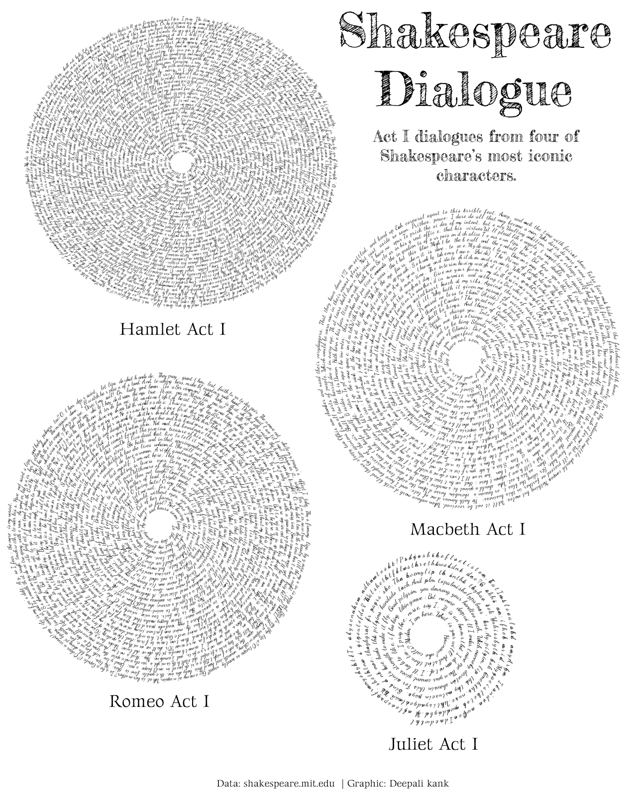
For Day 3 of the #30DayChartChallenge, the theme was “Circular,” and I decided to embrace the prompt in a more interpretive and artistic direction. Instead of choosing a conventional chart type like pie or radial bar charts, I ventured into visual-textual territory by translating Shakespearean drama into spiraling patterns.
I selected four of the Bard’s most iconic and widely studied plays Hamlet, Macbeth, Romeo and Juliet and narrowed the focus to Act I of each. Act I is where the world of each play is introduced, characters are established, and foundational tensions are seeded. It seemed like a fitting scope for both visual and narrative clarity. My aim was to depict the distribution of dialogue: how much each character contributes verbally at the very outset of the story.
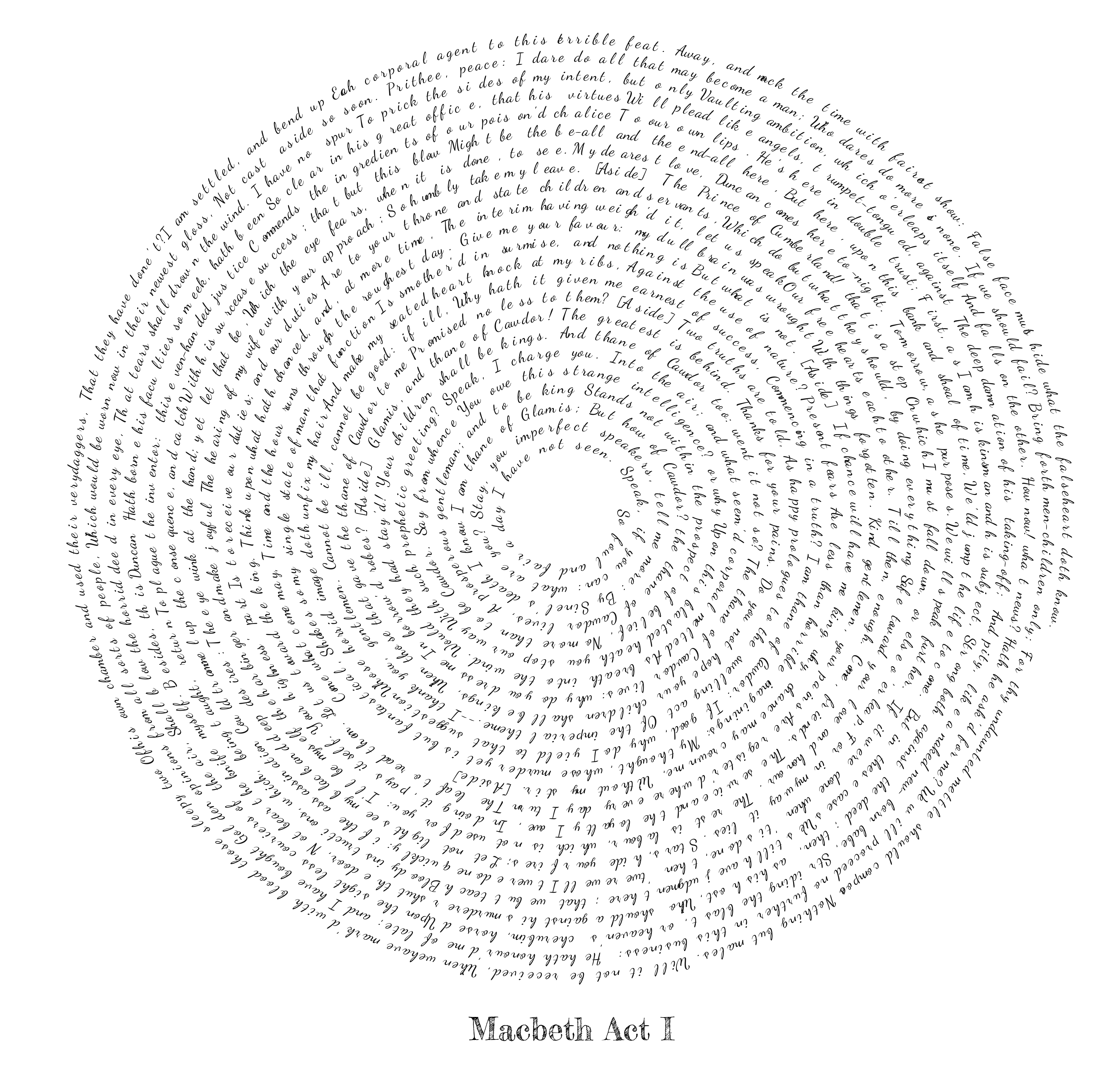
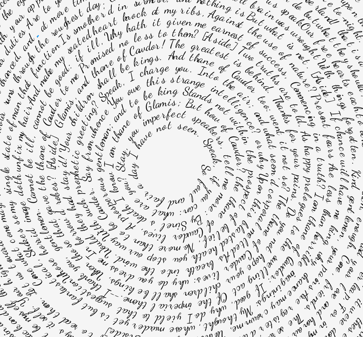
To do this, I built spirals composed of the characters’ lines, flowing outward from the center in circular progression. Each spiral visually encodes a single character’s speech in Act I. The text wraps around in gentle arcs, and the size of the spiral corresponds to the total number of words spoken. Those who dominate the dialogue naturally extend farther from the center, while those with a brief presence hover nearer to the core.
This was my first time working with text spirals, and it was both a creative and technical stretch. Laying out readable spiraling text required careful planning of angles, spacing, and curvature. On the backend, I used R for text cleaning and data wrangling pulling in raw scripts, tokenizing the lines, and counting words per character. Then, in D3js via Observable, I rendered each spiral with custom SVG paths and text-on-path logic, tweaking the spiral function to ensure aesthetic balance and legibility.
As I iterated, I began to appreciate the dual nature of this visualization. It sits at the intersection of data visualization, literary analysis, and generative art. There’s a kind of poetic resonance in seeing Shakespeare’s words physically spiral outward almost as though the characters are literally speaking their way into the world.
This exercise also raised a few questions worth further exploration: To what extent does Act I foreshadow a character’s overall prominence in the play? How might the density or shape of a spiral suggest narrative weight, urgency, or imbalance? And what might similar spirals for Acts II through V reveal about shifts in narrative focus?
All in all, this was an enjoyable and rewarding departure from typical charting. It’s a reminder that data viz can be both expressive and analytical, especially when it plays with form and meaning in unconventional ways.